
Red is passion, blue is calm, black is luxury: what will be the right color for your customers’ tastes?
Color is magic. An element that has always fascinated man, presented in a thousand different forms and contexts.
You have your favorite one, the most unbearable. There is one that provokes a sense of calm, of love, or of power. Their beauty in the human mind is a priceless gift.
And this will undoubtedly be one of the greatest points of value on your website and in the choice of the brand logo in order to create a strong web reputation.
Because it may seem all organized.
You have the expert in creating websites, you have good content to offer to all users.
You know the SEO rules for indexing or de-indexing on Google and your product you can say that rocks.
But you still need it: the color. The road to understand customers’ emotions.
Index
The psychology of color in the minds of customers: here’s how it works
When our eye captures a nuance, it is sent to the region of the brain called the Hypothalamus. From there, it is converted into a large number of signals, finally received by the thyroid gland.
Now everything is converted into emotions by releasing hormones from the gland. And these are directly related to the impact that the nuance has had on the brain.
One can therefore well understand that this is not a psychological illusion, but a real biology.
We therefore understand in detail how these affect the minds of various consumers and how those who design the site must make their own choices.
Color and its emotions
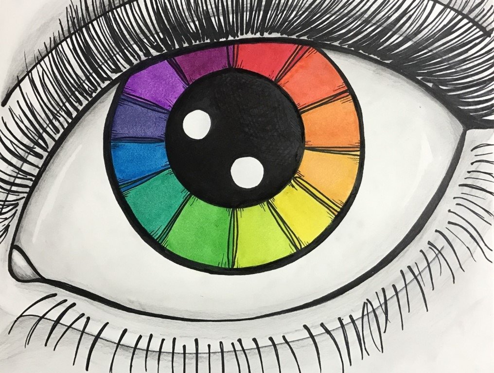
We’re looking at an artistic color wheel that we’re going to analyze now. It is important to have in mind how the shades are arranged on this wheel.
Their position relative to each other creates effective and scientific visual patterns. This will be discussed in more detail in Part 2.
YELLOW
Strongly attached to emotions, this first color boasts different moods in the eyes of observers:
- optimism and joy;
- fun and vitality.
It’s the brightest pattern of all and it doesn’t go unnoticed. Its strong quality is in fact due to this:
Its brightness tends to catch the eye’s attention, creating a stimulus in the brain.
Several famous logos have yellow as their main color, not by chance.
- Energy: DHL, Hertz, Shell, Caterpillar
- Speed: DHL, UPS
- Capture-attention: McDonald’s, Burger King, Best Buy, Snapchat
RED
Like the previous one, the impact on emotions is intense, but it also brings negative sensations:
- love and passion;
- strength and energy;
- danger and urgency.
It is a color that you can balance well and not to put in the wrong places. A red button on the monitor could make you think of a dangerous situation! But that also means quality:
Its bright tone creates urgency in buying, leveraging emotional impulses.
Red in companies.
- Food and attention catching: KFC, McDonald’s, Coca-Cola, Heinz, H&M
- Passion and stimulation: Netflix, Lego, Nintendo, YouTube
VIOLET
Here we move from emotions to perceptions and states of being, with strong impacts of conditioning:
- luxury and prestige;
- care and well-being;
- pleasures and delicacies.
Not to be used in discount or fast food, but to be placed in appropriate contexts, capable of releasing the quality of the purple:
transmits calm and wellness, with general positive mental states related to well-being, especially physical
But be careful, because it is also often associated with excess and extravagance. The Batman Joker is the perfect example.
Violet in companies.
- Confectionery: Wonka, Milka, Cadbury;
- Luxury: Crown Royal, Hallmark, New York University, Aussie;
- Also often found on products of the cosmetics market.
BLUE
It stands as the #1 color preferred by both men and women, placing itself with strong powers of perception and states of being like purple:
- peace and serenity;
- trust and security;
- stability and loyalty.
And from these points you can well understand what is its quality that most captivates the public:
generates a sense of freedom and trust in the brand, making the customer feel at ease.
And in large numbers it is among the most popular colours in the logos of influential multinationals, as well as in social networks.
- Technology: Samsung, Intel, HP, Siemens, Blu-Ray, Panasonic;
- Social: Facebook, Twitter, Linkedin;
- Banks: Goldman Sachs, Bank of America, American Express, Barclays.
GREEN
Although known as the color of money, it does not present itself as the color with the most impact on the list: But certainly not to be ignored:
- well-being and health;
- peace and inspiration;
- link with nature.
It is an ambivalent pattern, where on the one hand you have the appearance of relaxation and nature, while on the other hand the one of power, finance and money. One can say, however, that in general its quality is:
transmits a feeling of relaxation and health, both physical and social.
creates a state of success and desire to participate in growth
Green in companies.
- Food: Whole Foods, Starbucks, Heineken, Perrier, Monster;
- Links to nature: Animal channel, Land Rover, Roots Canada;
- Business: Android, Bp Oil, Holiday Inn, Spotify, Xbox.
ORANGE
To conclude the color wheel we return to an emotional pattern:
- enthusiasm and creativity;
- courage and confidence;
- energy and fun.
And like his red brother, he plays a key role in the engagement aspect of the customer, having the quality of:
attracts attention and create purchasing instincts, often associating at competitive and cheap prices.
Orange in companies.
- Savings: Payless, Amazon, Easyjet;
- Energy and Fun: Fanta, Nickelodeon, JBL, Harley Davidson.
Colours that are not colours: Black and White
Although not present in the wheel as no colors by definition, are fundamental in today’s business
BLACK
To some it may appear as sad and gloomy, but often the effect is of great strength:
- luxury and power;
- elegance and taste;
- sophisticated and authoritarian.
With this color it is clear where the quality will impact on the customer:
sensation of precision and seriousness, it has a particular impact on the appeal.
And here’s how most brands are on the trend of luxury and fashion.
- Luxury and Fashion: Chanel, Rolls Royce, Under Armour, Yves Saint Laurent, Armani, Hugo Boss.
WHITE/SILVER
We conclude with two closely related colors in terms of impact and sensations:
- innocence and purity;
- simplicity and neutrality;
- modernity, logic and future.
And especially for this last point, here’s how the quality of these colors, and especially the silver, becomes:
transmits logic and perfection, often associated with factors of design and luxury tech and futuristic.
White and silver in companies.
- Technology: Apple, Sony, Bosch, Microsoft;
- Automotive: Tesla, Mercedes Benz, Toyota, Mini;
- Luxury: Burberry, Cartier, Prada, Lancome.
We now know how colors are perceived by the customer’s mind. And as always, the best way is to put yourself in the shoes of a buyer to understand what you really think and want.
We continue in Part 2 to find out how to apply these patterns to a design strategy.